Boost Your Conversion Rate by up to 400% : Landing Page Secrets Most Businesses Miss
Boost Your Conversion Rate by up to 400% : Landing Page Secrets Most Businesses Miss
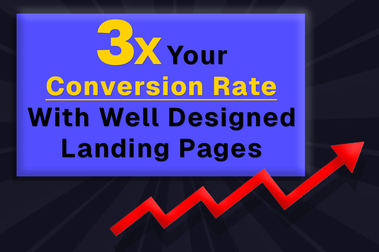
Are your ads directing traffic to a dedicated landing page? If not, you're missing out on potential customers, period. Need proof? Instapage conducted an experiment comparing an ad campaign that sent traffic to either their standard home page or a dedicated landing page built specifically for the ad. The result? A 400% increase in conversion rate from this one change alone.
Designing specific landing pages for ad campaigns is considered best practice among experienced ad managers, yet most businesses don't do it. Why? There are several challenges:
► Creating specific landing pages takes significant time and energy
► Designing and testing pages can be daunting for beginners
► Many business owners lack time to develop new webpages for each campaign
► If your current ads deliver "acceptable" results, you might not see the need
But here's the issue: without a proper reference point, how do you know if your "good enough" results are actually good? Without seeing what fully optimized campaigns can deliver, you're likely leaving money on the table.
Effective landing pages matter whether or not you're running paid ads. Most website visitors never leave the first page they land on—often your home page—and many don't even scroll to the bottom. Optimizing any landing page, whether it's your home page or a dedicated page for paid traffic, can significantly increase your conversion rates.
In this article, we'll cover key considerations for designing effective landing pages. Consider this your introduction to Landing Page Design 101. If you want to learn more, we encourage you to reach out to us. Digital Marketing Charlotte are your local PPC and Web Design experts, offering chamber members free landing page audits. Want to know how your landing page performs and how to improve it? Contact us for a free audit where we'll review and grade your page design and provide actionable improvement tips.
Above the Fold
The "above the fold" area refers to the part of your webpage that's visible without scrolling. This concept comes from newspaper publishing, where the most important headlines appeared above the fold of the paper. In web design, it's your first impression and most valuable real estate.
Consistent with Ad Copy
When someone clicks on your ad, they expect to find what was promised. If your ad mentions a "50% off spring cleaning special," your landing page should immediately highlight this same offer. This consistency reassures visitors they're in the right place and reduces the chance they'll click away.
Think of it like this: if you saw an ad for pizza, clicked it, and landed on a page talking about sandwiches, you'd probably leave immediately. The same principle applies to your landing page.
Introduces Pain Point/Solution, Features Value Proposition, Establishes Credibility
Your above-the-fold content should quickly address:
► The problem your customer is facing ("Tired of unreliable plumbing services?")
► How you solve it ("Our plumbers arrive on time, guaranteed")
► Why customers should choose you ("Serving our community for 25 years")
This trifecta answers the three questions every visitor has: "Do they understand my problem?", "Can they solve it?", and "Can I trust them?"
Clear Conversion Action
Every landing page needs a clear next step for visitors. This could be:
Button (Book Now, Buy Now, Call Now, Request Quote, etc.) Make your button stand out with contrasting colors and clear, action-oriented text. Don't use generic phrases like "Submit" or "Click Here." Instead, be specific about what happens when they click: "Get My Free Quote" or "Schedule My Appointment."
Embedded Form If you're collecting information, keep your form short and simple. Every field you add reduces completion rates. Ask only for essential information (name, email, phone) and save detailed questions for follow-up conversations.
Covers 50% or More of Page
Your primary message and call-to-action should dominate the screen. If visitors need to hunt for information or your contact button, you're making it too difficult. Design your page so the most important elements take up at least half the visible area without scrolling.
Page Sections
After the above-the-fold area, organize your content into clear sections that guide visitors toward conversion.
Value Proposition or Competitive Advantage
Expand on what makes your business unique. This isn't just about being "the best" - it's about being specific:
► "Same-day service for emergency repairs"
► "Flat-rate pricing with no surprise fees"
► "Locally owned and operated for 20 years"
Visitors should understand not just what you do, but why they should choose you over competitors.
About Us
Keep this section brief and focused on how your story benefits customers. Instead of "Founded in 2005," try "Since 2005, we've helped over 5,000 local homeowners save on energy costs." Connect your history to customer outcomes.
Testimonials or Reviews
Nothing builds trust like hearing from satisfied customers. Include:
► Full names when possible (or at least first name and last initial)
► Photos of customers (with permission)
► Specific results ("Jane saved $2,300 on her home renovation")
One detailed, specific testimonial is worth more than ten vague ones.
Proof (Case Studies, Past Projects, Success Stories, etc.)
Show concrete examples of your work. Before-and-after photos, case studies, or project galleries give visitors confidence in your abilities. For service businesses, consider including:
► Results achieved for clients
► Problems solved
► Timeline of projects
► Customer satisfaction metrics
Products/Services
Clearly outline what you offer, focusing on benefits rather than features. Instead of "We offer lawn mowing services," try "Enjoy a perfectly manicured lawn without lifting a finger." Make it easy for visitors to understand exactly what they'll get.
Additional Call to Actions
As visitors scroll down your page, continue providing opportunities to convert. Not everyone will be ready to make a decision at the first call-to-action. Repeat your primary action button at logical points throughout the page.
Lead Magnet (If Applicable)
A lead magnet offers something valuable in exchange for contact information. This works well for visitors who aren't ready to buy but might in the future. Examples include:
► Free guides or checklists
► Video tutorials
► Discount codes
► Free consultations or assessments
Your lead magnet should directly relate to your services and demonstrate your expertise.
Overall Design
Scannable
Most visitors won't read every word on your page. They'll scan for relevant information. Make this easy by using:
► Bullet points
► Short paragraphs (3-5 lines maximum)
► Subheadings
► Bold text for key points
► Plenty of white space
A clean, scannable page helps visitors find what they need quickly.
Cohesive Design Using Brand Colors and Imagery
Maintain visual consistency with your brand throughout the page. Use your brand colors for emphasis and include imagery that represents your business authentically. Stock photos are fine if they look natural and relevant, but custom photography of your team, facility, or work is even better.
Concise Headings
Your headings should convey the main point of each section in just a few words. A good heading is both informative and intriguing. Instead of "Our Services," try "How We Help You Save Time and Money."
Bold Headings
Make your headings stand out with larger fonts and possibly different colors. This helps visitors navigate your page and find relevant sections quickly.
User Experience
Fast Load Times
A slow-loading page drives visitors away. Aim for a 90 or higher on Google's PageSpeed Test. Improve your load times by:
► Optimizing image sizes
► Minimizing plugins and scripts
► Using a reliable hosting service
► Enabling browser caching
Even a one-second delay can significantly reduce conversions.
Optimized Design for Mobile and Tablet
More than half of web traffic comes from mobile devices. Your landing page must look great and function well on all screen sizes. Test your page on multiple devices to ensure:
► Text is readable without zooming
► Buttons are large enough to tap easily
► Forms work properly on touchscreens
► No horizontal scrolling is required
High Contrast Text
Make sure your text stands out against its background. Dark text on a light background (or vice versa) is easiest to read. Avoid placing text over busy images or using colors that blend together.
Legible Font
Choose readable fonts and appropriate sizes:
► At least 16px for body text
► Sans-serif fonts (like Arial or Helvetica) are generally easier to read online
► Limit your page to 2-3 font styles maximum
► Avoid decorative or script fonts for body text
Not Too Busy
Resist the urge to fill every inch of space. A cluttered page overwhelms visitors and dilutes your message. Follow the "less is more" principle:
► Focus on one main message per section
► Use images purposefully, not decoratively
► Remove anything that doesn't directly support your conversion goal
► Provide enough white space to let content breathe
Remember, your landing page has one job: to convert visitors into leads or customers. Every element should serve this purpose.
Conclusion
Creating effective landing pages isn't just about looking good—it's about strategically designing every element to guide visitors toward taking action. By optimizing your above-the-fold content, organizing your page into clear sections, maintaining a clean design, and ensuring a positive user experience, you'll significantly increase your conversion rates.
Ready to improve your landing pages but not sure where to start? Remember that The SMB Strategists offer free landing page audits for chamber members. We'll review your current page, identify opportunities for improvement, and help you create a high-converting landing page that generates real results for your business.
Contact us today to schedule your free audit and start converting more visitors into valuable customers.
Visit Digital Marketing Charlotte and learn more about how we can help you marketing your business!